If you’re looking to get inspired by some beautiful art portfolios or just want to steal a few website examples, I’m here to be your partner in crime!
Jokes aside, having a good source of inspiration to build your own art portfolio website is very important. You need to learn with professional artists! Learn what they did right and what they did wrong.
I’ve analyzed 19 different art portfolio websites to see what worked and what didn’t, so you can make all the right decisions and avoid the wrong ones!
With that said, keep in mind that these are just my personal opinions.
So let’s get into some of the best art portfolio website examples available online today!
Table Of Contents
- 1 1. Justin Kleiner
- 2 2. Angelarium by Peter Mohrbacher
- 3 3. Mark Pease
- 4 4. Shantell Martin
- 5 5. Signalnoise (James White)
- 6 6. Jesse Zhang
- 7 7. Francesco Pirini
- 8 8. Susann Hoffman
- 9 9. Essi Kimpimäki
- 10 10. Loish
- 11 11. Trudi Castle
- 12 12. Glauber Kotaki
- 13 13. Djamila Knopf
- 14 14. Emily Cheeseman
- 15 15. Katie O’Neill
- 16 16. Carey Pietsch
- 17 17. Yoshi Yoshitani
- 18 18. Andrew Mar
- 19 19. Igor Terekhov
- 20 How Do You Make A Good Art Portfolio Website?
1. Justin Kleiner
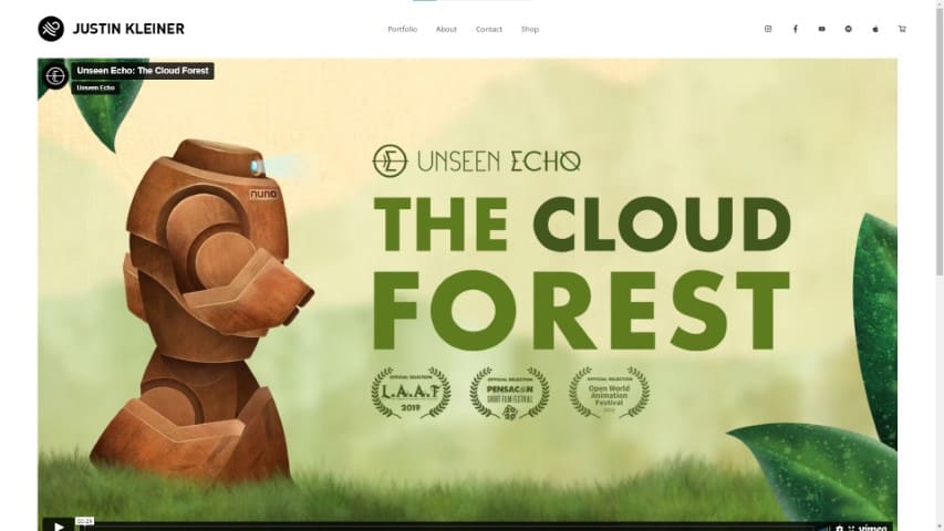
Justin Kleiner is a California musician and visual artist, making their portfolio website very interesting to work with!
Since Justin works with music and sound, the main page of the portfolio has a video, which makes complete sense. Being a multimedia artist , Justin has to showcase their work with something other than still images.
In fact, if you explore the portfolio website’s sections, you’ll see that most of Justin’s projects have either sound or video right away!
Along with some extra images of each project.
So let’s sum up what, in my opinion, are some great takeaways in this art portfolio website and what could be better.
What They Did Right
- Clean Interface
- Easy To Navigate
- Good Contact Form
- Shop/Store Section
- Discrete Social Media Links
- To-The-Point About Section With Work History
- Good Mobile And Desktop Layout
What Could Be Better
- More Descriptions/Behind The Scenes Information On Justin’s work. Even though there are quite a couple of photos, images, and music/sound in each project, I think it would be great to learn more about each. Maybe some behind-the-scenes images with some text describing the inspiration for the work would improve it.
- A Newsletter Form for fans.
2. Angelarium by Peter Mohrbacher
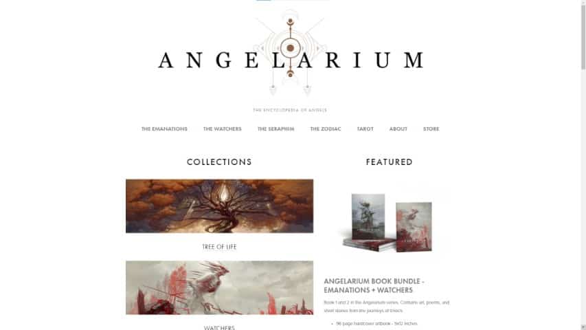
Angelarium is one of Peter Mohrbacher’s projects. Angelarium’s portfolio website is a joy to see, with several sections for each type of illustrations.
Each work also usually includes a small description and sometimes even a process sketch! This is great since it adds extra layers of information to each project.
Not only that, but there are sometimes process videos showing how the art was created.
The whole site has a very clean and straightforward interface, with clear colors contrasting the artwork.
What They Did Right
- Easy To Navigate
- Newsletter Form
- Good About Section
- Shop/Store Section
- Process Videos
- Some Sketches
What Could Be Better
- Social Media Links Could Be More Present. There are social media links at the bottom of the page, and there’s a whole instagram gallery that automatically updates. But If someone is trying to follow Angelarium’s or Peter Mohrbacher’s social media networks, these can be hard to find at first.
- Bigger Descriptions. There’s a small description for each portfolio project on Angelarium, but they’re quite short. I’m pretty sure there are longer descriptions and information on the books though, so it makes sense not to give everything away for free. With that said, I would love to be able to know more about each piece, the inspiration and the process for it on the website.
3. Mark Pease
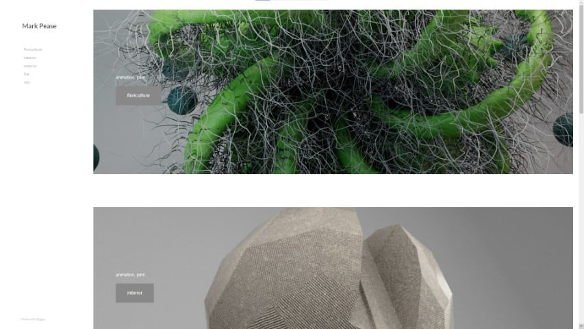
Mark Pease is an artist living in Southern Illinois that teaches courses in computer graphics, digital animation, video art, and 3D modeling at Southern Illinois University Carbondale.
Most of the work in his portfolio is 3D, so there are a lot of high-quality renders and videos.
The website is relatively easy to navigate, with a clean interface and a main focus on the actual portfolio. With that said, the section links on the left are very small, making them hard to check out.
Something that you don’t see quite often in other artist’s portfolio is a CV (Curriculum Vitae) with information on work and study history. And Mark has a simple but useful CV on his info section!
I think more artists should learn from this and incorporate this type of information in their about section. Specially if they’re looking to be hired by companies.
What They Did Right
- CV PDF On Info Section
- Clean Interface
- Easy To Navigate
- Descriptive About Section
- High-Quality Images And Video
What Could Be Better
- About Section Has A Big Block Of Text. The about section on this portfolio website makes it a bit hard to read. It would be relatively better if it were split into shorter paragraphs or cut a bit in my opinion.
- No Description On Each Project. Most of Mark’s work has no description or information. I understand this is a highly visual portfolio, but I would still like to learn more about the process of creating the pieces. As well as what software was used and the thought behind each project.
- Contact Information Hidden Inside CV File. I currently couldn’t find any contact information for Mark other than inside his CV file. This can make it hard to contact him.
- No Social Media Links. Maybe Mark doesn’t have social media profiles, but I couldn’t find them on his portfolio website if he does.
- Tiny Clickable Links For Each Portfolio Section.
4. Shantell Martin
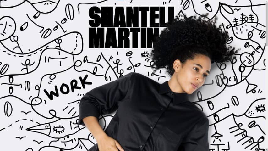
Shantell’s portfolio website is quite well done and a great art portfolio website example. Just by opening it up, you notice right away that a great care and attention to details was made when creating it.
It’s a fast-loading portfolio website, with high-resolution images and graphics, and even an interactive background!
Shantell’s portfolio website also includes links to the usual places:
- Shop
- Social Media
- Work
- Info
This artist’s About/Info page even includes a nice Contact button and a Press Kit! I will have to say that it is a bit packed with text though, making it somewhat hard to read.
Each project of Shantell has detailed descriptions with many process images and photos at different angles. This makes each project quite a journey to follow.
What They Did Right
- Detailed Projects
- Unique Website Layout
- Good Navigation
- Process Photos
- Good Project Descriptions
- Contact Form
- Interactive Background
- Shop/Store Section
- CV On Info Section
What Could Be Better
- Hard To Read Info Page. Shantell’s Info page is a bit convoluted, with huge blocks of text taking an ample space. This is good to learn a lot more about this artist’s work, but could be layed out in an easier-to-read display or even cut back a bit.
- Work Section Can Be Overwhelming. While browsing the Work section, you’ll have to scroll a lot to cover it all. Not only that, but images will appear a bit randomly throughout the scrolling, which you can click to learn more about. This is primarily a personal preference, but I think it would be easier to navigate if it had a more straightforward layout.
- No Newsletter Signup. Since Shantell has different shows throughout the years, I would expect to find a newsletter to keep interested viewers updated on showtimes. I couldn’t find any newsletter signup anywhere on the site.
5. Signalnoise (James White)
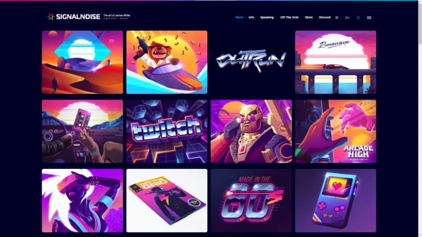
James White’s art portfolio website (Signalnoise) has a distinct look that showcases what their work is all about right away! With colorful 80s tones and solid and sharp graphics, this beautiful art portfolio website example is very inspiring.
This Canadian artist from UK has worked for Toyota, Twitch and many other companies.
James’ portfolio website is all about neon-infused art projects, and you can tell that right away just by taking a glance at the website’s main page.
The information/about section on this art portfolio website isn’t too long, and it includes several brand names (Red Bull, Toyota, Canon, Nike, etc) that show that James is a great professional in the industry.
What They Did Right
- Showreel Video
- Strong Portfolio Theme
- Social Media Links
- Contact Info
- Process Images And Videos
- Easy To Navigate Website
What Could Be Better
- More Process Images And Videos. There are greatly detailed projects with several images and even videos. But some projects only have a small sentence and a single image. This makes the whole experience a bit inconsistent, and I personally think it would benefit this art portfolio website greatly!
- Longer Descriptions. Most projects only have one or two small sentences. A longer description or thought process behind each project would make wonders for this art portfolio!
- No Newsletter Signup.
6. Jesse Zhang
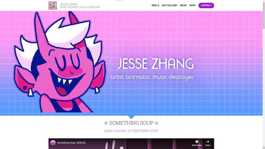
Oozing with personality, Jesse Zhang’s art portfolio website is a wonderful example! It includes different types of reels you can look at and admire, as well as a neat gallery with this artist’s work.
The landing page has a big art of one of their characters, showcasing Jesse’s artwork right away. There’s also a sticky bar at the top that will automatically scroll your page to the desired section with a single click.
Other than that, there is also a simple but cute contact form and several links to different social media platforms right below.
What They Did Right
- Charismatic Landing Page
- Good Navigation
- Big Contact Button At The Top
- Social Media Links
- Showreel Videos
- Shop/Store Section
What Could Be Better
- More Extensive And Descriptive Projects. The illustration work on this art portfolio website has no accompanying description, process images, or videos. It’s just a single illustration that you can click on and admire. This isn’t super bad, but it would be great to have an option to learn more about each piece and its creation.
- Extra Information On The Artist. Other than the small 4 sentences at the bottom of the website, there isn’t much information on Jesse Zhang. If some interested party is interested in knowing more, they’ll have to use the contact form.
- No Newsletter Signup.
7. Francesco Pirini
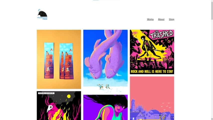
With a wonderfully simple and easy-to-navigate layout, Francesco Pirini’s portfolio website is lovely.
When you land on their main page, the website showcases a gallery of neatly arranged artwork with strong colors. Showing you right away the style of this artist!
When you click on one of the projects, you’ll get more illustrations and information on each. It’s a bit lacking in depth for each project, but some have more than others.
One thing that I noticed right away is that this website is not secure with an SSL certificate. This is an easy fix, so I would advise every artist to have their website secure (https)!
What They Did Right
- Portfolio Focused On The Artwork
- Strong Theme
- Easy To Navigate
- Easy To Read About Section
- Social Media Links
- Shop/Store Section
What Could Be Better
- Website Missing SSL Certificate. This is the main thing I would change about this art portfolio website. People fear non-secure websites, and it’s such an easy fix that it makes no sense not to have it!
- Some Projects Have Little Information. While some projects have a decent depth with several illustrations and a little text, others have little information. Viewers like to know more about the process of the artwork creation and behind-the-scenes footage.
- No Newsletter Signup. I know I mention this a lot, but it can very worth your time to have a simple signup form for people interested in updates from you!
8. Susann Hoffman
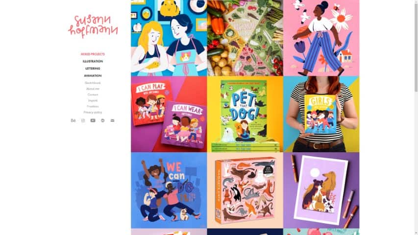
Susann Hoffman’s site is an excellent art portfolio website example from which you can get inspired!
When you open up this art portfolio, you’ll notice a lovely clean gallery filled with beautiful artwork. After you click on each project, you’ll find more details and merchandise of that artwork in some cases!
Susann’s social media links are pretty easy to find, both in the sidebar and at the bottom of the page.
I like how most projects have quite a few different shots, I just wish all of them had this! Some process images and more extensive descriptions would also be an excellent addition to these projects.
With that said, this is a beautiful art portfolio website example that you should keep on your bookmarks while building your own.
What They Did Right
- Easy To Navigate
- Clean Layout
- Contact Information
- Lovely About Section
- Social Media Links
- Downloadable Freebies
- Process Videos
What Could Be Better
- Not Enough Project Information. Some projects only have a single image with almost no description. And while others do have more images, merchandise and even process videos, there’s still little written information on each project!
- No Newsletter Signup Form.
9. Essi Kimpimäki
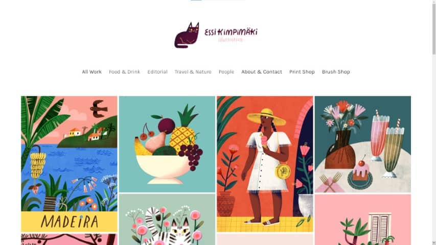
Essi Kimpimäki’s portfolio website has a very clean user interface and a gallery showing up straight away on the landing page.
With many different sections to choose from, it’s easy to find what type of work a potential hiring company is looking for. The “About & Contact” section is pretty short and to the point, with a clickable contact email.
I would say it might be a bit too short though, not having much information to read about the artist.
It’s excellent that Essi has two different sections for different types of shops! Making it easier for interested people to get some Prints and Brushes.
There’s no newsletter signup, though. I find it a bit unfortunate, especially considering that Essi sells prints. This would be a great way to boost their sales whenever a new product is available.
What They Did Right
- Good Clean Gallery
- Easy To Navigate
- Contact Information
- Shop/Store Section (2 Shops!)
- Clean Layout
- Gallery Always Below Each Project
What Could Be Better
- No Newsletter Signup Form.
- Not Enough Project Information. Each project only has one or two sentences describing it. There are also only a few different shots in a few projects. Most of them only have a single illustration/image.
- Social Media Links A Bit Hidden. This will depend on how much you value your social following and presence, but the social media icons are quite hidden on the page. You need to scroll all the way down to the bottom of the page to see them.
10. Loish
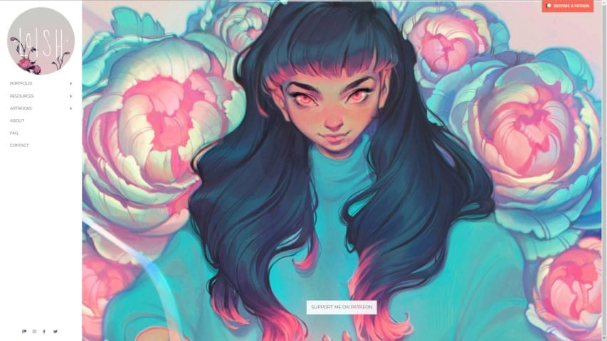
Loish (Lois Van Baarle) is a widely known artist worldwide, with an art style that is super characteristic of this artist.
When you land on Loish’s art portfolio website, you’ll find artwork pieces that keep sliding over, showing you new ones every few seconds.
On the left sidebar, you have clean navigation, showing the Portfolio, Resources, Contact information, and more. Every topic is split into its own section, making it pretty easy to navigate.
The About section is also very personal and has interesting information about Loish and their education. I only wish there was more information on Loish’s projects as well!
What They Did Right
- Clean User Interface
- Rotating Artwork On Landing Page
- FAQ Section
- Good Personal About Section
- Great Contact Form
- Sidebar Social Media Links
What Could Be Better
- No Newsletter Signup. In the case of Loish, I think this would be hugely beneficial since this artist runs a Patreon and Shop. It would boost their sales and new patrons quite a bit by just sending a few monthly emails.
- Not Enough Project Information. Most projects only have a single illustration and title, with a link to the collection they belong to. I think having a descriptive text about the illustration, the process, and some behind-the-scenes would be fantastic. With that said, I know Loish includes some behind-the-scenes info on Patreon, so maybe that’s why the Projects are very simply put.
11. Trudi Castle
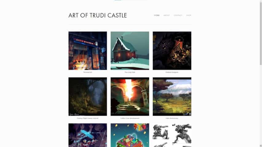
Trudi has a wonderfully clean and easy-to-navigate art portfolio website, making it a great inspirational example!
On the landing page is a lovely gallery of different projects, and when you click or tap on each one, you’ll find many illustrations from that project. It’s quite a pleasant journey to go through.
The about section has a nice list of different companies Trudi has worked for, as well as publications! This is a great way to let others know about Trudi’s professional past.
Unfortunately, the personal information is only about 3 sentences short, which I think is a little too low.
What They Did Right
- Good Project Collections
- Portfolio Focused On Artwork
- Previous Companies/ Publications List
- Clean User Interface
What Could Be Better
- Not Enough Project Information. Even though each project has a beautiful collection of different illustrations, most have almost no descriptio. It would be fantastic to have more information on the ideas behind each project, what the briefing was or perhaps some behind-the-scenes footage!
- Social Media Scattered Throughout The Website. Once again, this depends on each artist’s interest in expanding their social media presence. But from what I could find, there’s only a Twitter icon at the bottom of every page, and the rest of the social media is a bit scattered. You can find a Tumblr link on the Contact section and an Instagram link in the About section. It would be worth having an entire clickable section with all the social media links, in my opinion.
- Very Short About Section Information. It’s actually a decently sized “about section” with the publication and previous companies list, but there isn’t much information about the artist. Which I think would give a nice, more personal touch to the entire art portfolio website!
- No Newsletter Signup Form.
12. Glauber Kotaki
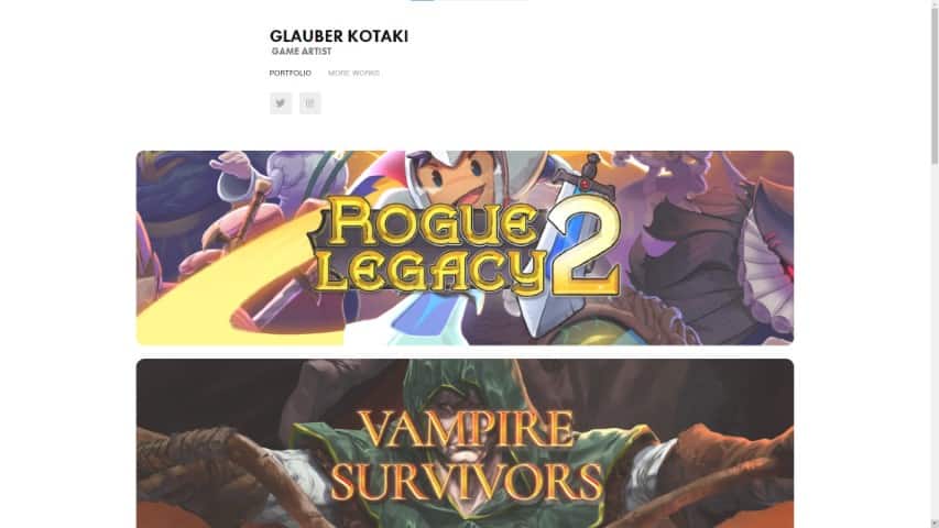
Glauber Kotaki is an incredible artist who has worked on several projects, such as Rogue Legacy 2, Vampire Survivors, and Duelyst.
The projects on Glauber’s portfolio website include several different images, making it very interesting to see how each individual animation or illustration fit into the project.
This art portfolio website example includes a “banner-style” approach to each project, with an extensive project cover in the center.
It’s pretty interesting to check out and a good option when you want to showcase only a few projects!
Social media links are right below the different section links, making it easy to check out Glauber’s work on other platforms. Unfortunately, there aren’t many sections, and it’s missing a Contact and About section.
What They Did Right
- Good Banner Style Project Covers
- Clean Interface
- Social Media Links
- Projects With Different Images
What Could Be Better
- Not Enough Project Information. Even though there are different images and animations on each project, there isn’t much descriptive information. It would be amazing to read more about each project’s inspiration and behind-the-scenes info.
- Only 2 Sections. There are only two sections on the entire art portfolio website, “Portfolio” and “More Works”. This is a very low number of sections, and
- No Contact Or About Section. Having no way to know more about an artist or how to contact them is usually the wrong route to take. Nowadays, it’s essential to have an About and Contact section on each art portfolio website, in my opinion.
13. Djamila Knopf
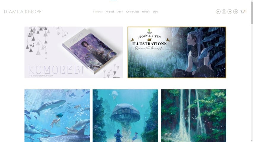
Djamila Knopf’s art portfolio website is very clean, with informative and easy-to-understand sections.
At the top, you’ll find links to Djamila’s Art Book and Class, so it looks like these two topics are very important for this artist.
You can find many helpful sections such as Illustration, Art Book, About, Contact, FAQ, and more on the navigation.
Everything is split up into groups, making it super easy to navigate. This is a fantastic art portfolio website example with easy-to-use navigation.
There are also social media icons at the top of the page and links to a store and Patreon.
In my opinion, the only con of this art portfolio website is the lack of information on each project. There are no accompanying text or process images to be found.
You need to hover over the image to find out the project’s name.
What They Did Right
- Good Sections
- Easy To Navigate
- Clean Interface
- Social Media Links
- Shop/Store Section
- Newsletter Signup Form
- Contact Info
What Could Be Better
- Not Enough Project Information. There’s no description on each project, nor any extra images showcasing the creation process or behind-the-scenes footage.
14. Emily Cheeseman
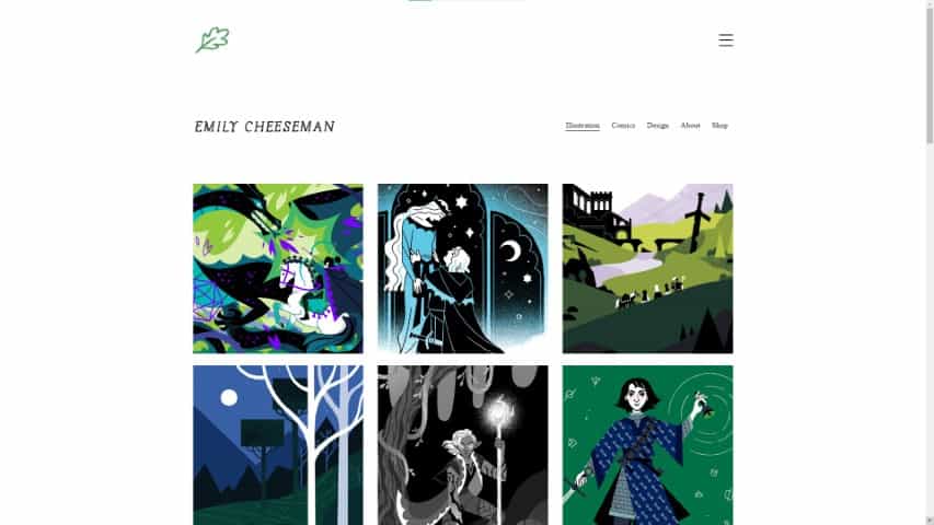
Emily Cheeseman’s art portfolio website has a tidy gallery that is very easy to navigate.
With a clean interface and good navigation, this portfolio includes several images per project. One of them usually is a close-up of the piece, which is a great way to increase the depth of your project!
There’s also an interesting and personal About section, which includes multiple ways to contact Emily and their work.
Not only that, but there’s also a Shop section on this art portfolio website, linking to Books, Zines, Enamel Pins, and much more.
What They Did Right
- Nice And Tidy Gallery
- Good Navigation
- Clean Interface
- Good Contact Info
- Shop/Store Section
What Could Be Better
- Social Media Links Somewhat Hidden. While present, the social media links on this art portfolio website are at the very bottom of the page.
- No Newsletter Signup. Since Emily has different products available for sale, it would especially make sense to have a newsletter.
- Not Enough Project Information. While each project usually has more than one image, it doesn’t include much information on them. It would be a great addition to knowing more about what inspired each project, behind-the-scenes information, etc.
15. Katie O’Neill
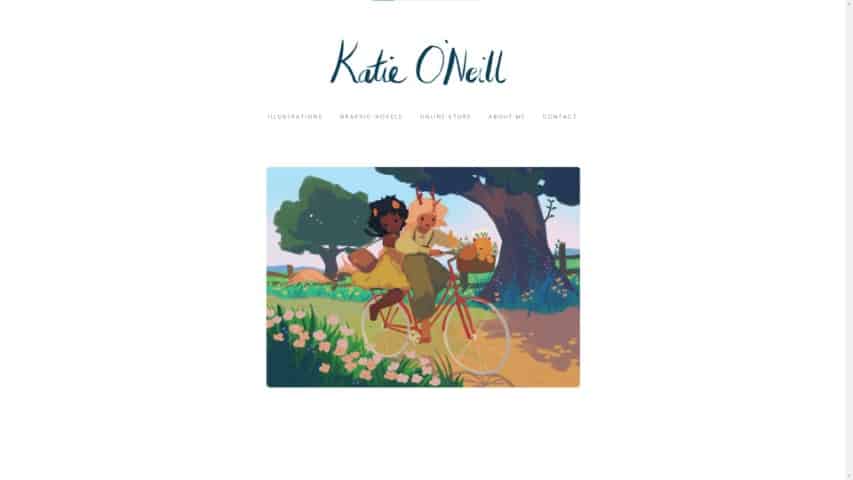
Katie O’Neill’s portfolio website is an excellent example of a website full of character.
With a landing page that has a single image, title, and clean navigation, this is an art portfolio that loves simplicity.
I especially like the Graphic Novels section, with several images to go through and a lovely description for each project.
Katie’s “About Me” section is also short and sweet. It could use some more information, but considering the website’s simplicity, keeping it on the short side makes sense.
The website theme also contrasts quite nicely with Katie’s artwork, making it pop up with its vivid colors.
What They Did Right
- Great Graphic Novels Section
- Clean Interface
- Good Navigation
- Shop/Store Section
- Lovely Landing Page
What Could Be Better
- No Newsletter Signup Form. There is no newsletter signup form on the website, which is a shame since people interested in new products from Katie would most likely signup right away.
- Not Enough Project Information On Some Projects. Even though the Graphic Novels section is wonderfully created, the Illustrations section is somewhat lacking in comparison. Having no information on each project and no title for each illustration.
- Website Missing SSL Certificate. This is a simple fix, but it seems the website is not SSL secured (no HTTPS). Posing some security risks.
16. Carey Pietsch
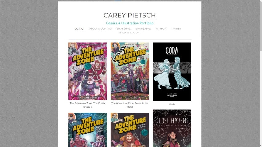
If you’re looking for a beautiful example of an “About Section” in an art portfolio website, look no further than Carey Pietsch’s website!
Starting with a beautiful illustration of this artist and a contact email right at the top, this about section is exceptionally well crafted.
It also includes excellent and personal information about Carey, making it much more approachable.
Each project in Carey’s art portfolio website includes different images you can browse, making it a very good experience.
Unfortunately, some images are blurry and somewhat low quality (especially the Adventure Zone projects), which makes the experience a bit worse.
What They Did Right
- Wonderful About Section
- Social Media Links In Navigation
- Shop/Store Sections
- Several Images Per Project
What Could Be Better
- Low Quality / Badly Compressed Images. Not sure if it’s a problem during the upload or if the images were already low quality when uploaded, but when checking each project, the images are not of the best quality. They show up pixelated and slightly blurred.
- Broken “Shop (Pins)” Link. The Shop (Pins) link isn’t working and throws an “Oops! We couldn’t find that page.” error.
- Not Enough Information On Each Project. While there are several images on each project, there isn’t much accompanying text to describe them.
17. Yoshi Yoshitani
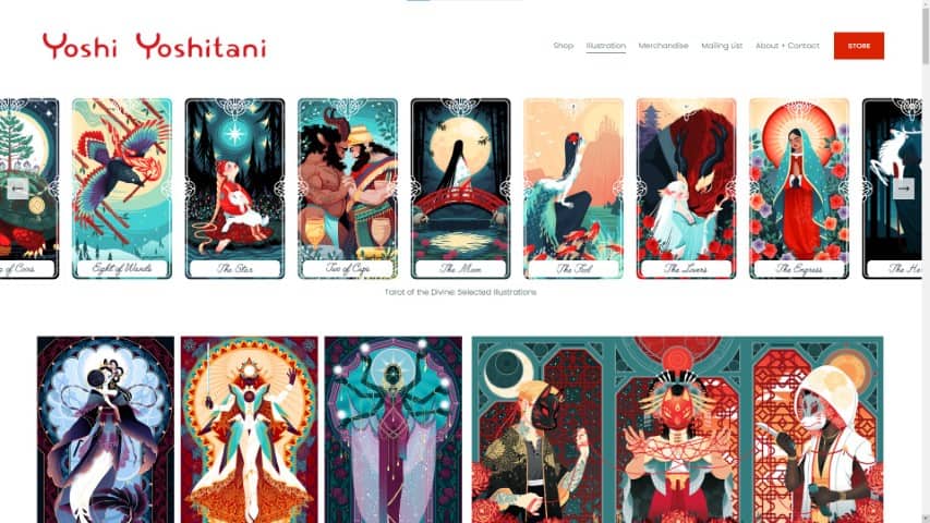
Yoshi Yoshitani’s art portfolio website is one of the best examples of colorful portfolios with a strong theme.
When you land on Yoshi’s website, you can see their robust portfolio. You get bombarded by color, with many different illustrations in the same style.
By scrolling through the pages, you’ll be greeted with a new illustration after another, making it a pleasant journey to go through.
There are shop links around, leading you to a lovely store with many different products you can buy. And even a Mailing list section that allows you to subscribe for updates!
Not only that, but the “About + Contact” section includes a list of Published Work, Selected Exhibitions, and even a Selected Client List.
I would appreciate a more extensive description of the artist on this page, though.
What They Did Right
- Wonderful Colorful Portfolio
- Newsletter Signup Form
- Shop/Store Sections
- Good About Section
- Great Navigation
What Could Be Better
- Somewhat Hidden Social Media Links. Links to different social media platforms are at the bottom of the website, and hard to reach in most sections.
- Not Enough Project Information. This is a very strict visual art portfolio website, with many images available to see and a great layout to encourage you to make a purchase. Unfortunately, there isn’t a lot of information on each illustration, which in my opinion, would make each project more interesting.
18. Andrew Mar
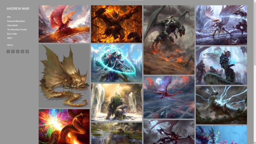
Andrew Mar is a highly recognized artist who has worked for Wizards of the Coast, Games Workshop, Bethesda, and much more.
You can find a very clean art portfolio website example here, with just the fundamentals in place!
Good sections split into categories, and social media links on the sidebar make this an easy-to-navigate experience.
In my opinion, this art portfolio could include more information on both the projects and the artist. This would make the user experience more personal and approachable.
What They Did Right
- Social Media Links
- Clean User Interface
- Good Gallery
- Easy To Navigate
What Could Be Better
- Tiny About Section. Even though the about section includes a contact email and previous clients list, there isn’t much information about Andrew here.
- Website Missing SSL Certificate. This art portfolio website is not secure, missing an SSL certificate. This is easy to fix, and every artist should have their website secure!
- Not Enough Project Information. Many art pieces don’t have a title, description or information on the project. It would make it a better experience to have more information on each project and process images.
19. Igor Terekhov
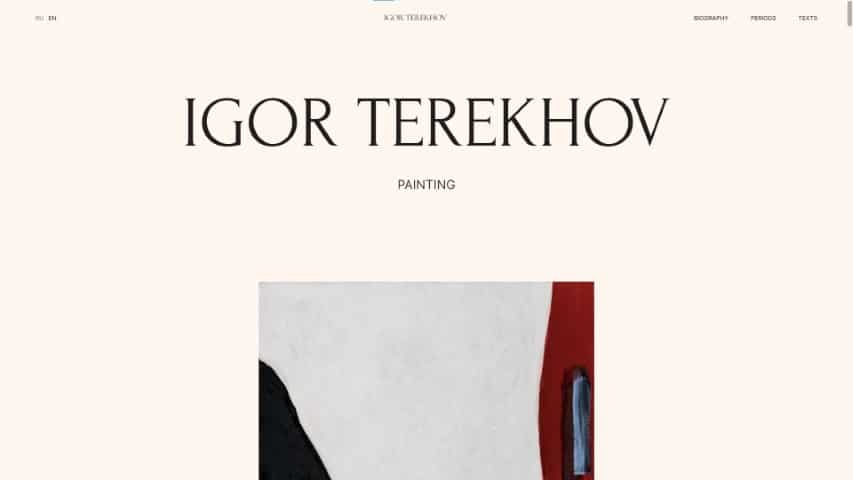
Going into Igor Terekhov’s art portfolio website is a unique and immersive experience.
From the ever-changing artwork on the loading screen to the smooth scrolling throughout the art pieces of this portfolio, you’ll be constantly amazed by what you’re seeing.
A great plus of this website is that since many Russian viewers visit it, there’s an option to change the entire website to Russian.
Nowadays, this isn’t a huge deal since you always have the option to use Google Translate to do the translation for you, but it’s a nice feature nonetheless!
What They Did Right
- Unique Portfolio Experience
- Great Biography Section
- English And Russian Language Option
- Texts Section
What Could Be Better
- Option For Simple Navigation And Usage. While this is a very unique experience, it can be a bit slow. Having an option to remove most of the animations would be great if a viewer just wants to take a look at the artwork of Igor Terekhov quickly.
How Do You Make A Good Art Portfolio Website?
Now that we’ve gone over all these beautiful examples of art portfolio websites, let’s go over what exactly makes a good art portfolio.
Many elements contribute to a great portfolio website, so I’m going to split these up and give you some tips.
1. Focus On Your Art Theme And Style
The first tip I can give you to make a great art portfolio website is first to consider what your overall art theme and style are all about.
Maybe your art style is more minimalistic. Then, a cleaner interface would work better for your art portfolio website. Keeping everything simple and with as few colors as possible.
But what if your art style is more chaotic and messy?
In that case, a more “over the top” website look would work better! Add lots of colors, graphical elements and throw some videos and .gifs here and there if your website allows it.
You can also do the opposite of your theme with a simple interface on a very messy art style, but in my opinion, it works best to be consistent! This way, when people enter your website they understand right away what your art style is all about.
2. Pick Your Best Work
Many artists want to showcase ALL of their artwork in their portfolio. They’re proud of their work (or at least, most of their work!) so they feel like it all belongs in their portfolio.
Don’t do this.
This is something that I cover more in-depth in our article on the biggest Art Portfolio Mistakes To Avoid, that you can read here.

Carefully pick your best work from all over the years and just showcase that.
As it’s said, “You’re only as good as the worst work in your portfolio.” This means that you don’t want to include lower-than-standard pieces.
Focus on only putting your best work into your portfolio. If you have to, refine previous older work that you’re proud of but feel that it needs some improvement.
Even if you have a much smaller portfolio since you’re not uploading all of your, that’s completely fine.
Quality over quantity!
3. Take Your Time Uploading And Crafting Your Projects

When creating an art portfolio website, you’re not just uploading art to a social media platform like Instagram, Tumblr, or Twitter. You’re uploading art that will be publicly displayed on your portfolio website for a long time.
So do take your time uploading your art in the correct dimensions, and ensure nothing is blurred or out of place. Double-check your pieces’ colors, saturation, and contrast on different screens if possible.
You want to make it look as perfect as you can!
That said, don’t wait around days and days trying to create the perfect project. Perfectionism is your enemy here, so upload it once you finish the project!
I would also recommend writing a few sentences about your project, describing its creation process and the inspiration for that project in the description. This actually also includes Instagram and other social media platforms!
Giving some sort of background or talking about the piece, in general, will help your viewers immerse themselves in your creation!
And one more tip on making a good art portfolio website is to really take inspiration from the examples we shared in this article!
Go through them slowly, save the ones you liked the most and see what specific aspects you want to take into your own portfolio website.
4. Always Include Contact And About Information
If you’re an artist trying to get contacted by hiring companies or even just by regular viewers that might be interested in purchasing or commissioning your art: include contact information!
Without contact information, it doesn’t matter how good your art portfolio website is, you won’t get contacted. A simple email address or contact form is more than enough! Just don’t forget to add it to your website.
And that goes for the About information as well.
People want to know more about you! Drop some information (no need to go too personal!) and perhaps a few photos. A great example of this is what Loish did on their “About” section, do check it out above.
While you’re here, you might also be interested in finding the best platforms to host your art portfolio website for free (click here to find out)!
Patricia Caldeira is the main writer here at Don Corgi. She's an art teacher with over 20.000 happy students across many platforms and courses!
Enjoy your stay and as always:
Keep on drawing!
")
")

