You might be thinking, ‘Color in art? Isn’t it just about using different shades and hues?’
Well, color in art is so much more than that.
It is a powerful tool that artists use to evoke emotions, convey messages, and create visual impact.
Not only that, but it also has many properties, a role in creating harmonies (color harmonies), and it even has temperature!
We will also take a closer look at the color wheel, and examine how famous artists have utilized color in their masterpieces.
So, let’s dive into color in art, one of the seven elements of art.
Table Of Contents
Key Takeaways
- Color in art is a powerful tool for evoking emotions and conveying messages.
- Understanding color theory and the color wheel allows artists to experiment with different color schemes.
- Primary colors (red, blue, and yellow) are the building blocks of all other colors.
Color In Art Definition
Color in art is an essential element that brings life and emotion to a painting or a sculpture.
It’s derived from reflected light, seen with the eye, and interpreted by the brain due to the light’s wavelength.
It refers to using the different properties of color to create a pleasing look to the art piece.
As an artist, you can use the different properties, color temperatures, and color harmonies to your advantage.
So let’s go over what each of these terms means!
Properties of Color
When discussing the properties of color in art, it’s important to understand three key points:
- Color hue refers to the specific shade or tint of a specific color, such as red or blue.
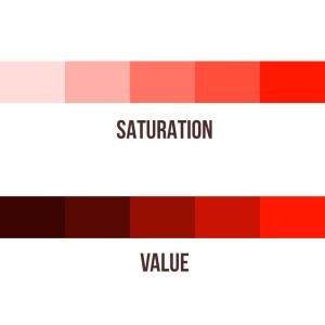
- Color value refers to the lightness or darkness of a color.
- Color saturation refers to the intensity or purity of a color.
By manipulating these 3 properties of color, you can change your artwork completely!
So let’s go over each of the properties.
Color Hue
The color hue refers to the purest form of a color, such as violet or red. So you can say that the basic definition of color hue is the name of the color you’re using.
You can then change the value and intensity to adjust the base color.
Color Value
Color value refers to the darkness or brightness of a color.
As an artist, you can create a darker or brighter artwork by changing the value of the colors.

You can also balance them out and create contrast this way!
For more about value drawing, check out this article!
Color Saturation (Intensity)
Color saturation refers to the intensity of a color, and how pure and vivid it appears.
Using a high saturation value on a subject or object will usually stand out more than a low saturated one.
You can tweak it also to create contrast between subjects or even to guide the eye of the viewer throughout the artwork!
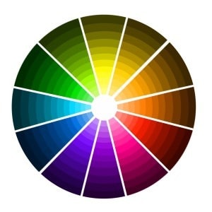
Color Wheel
The color wheel is where you can find all the primary, secondary, and tertiary colors.
It was invented by Sir Isaac Newton in the 17th century when he took the color spectrum and bent it into a circle.
The Primary Colors are the building blocks of all other colors and can’t be created by mixing other colors together.
Additionally, we’ll discover Secondary Colors, which are formed by mixing two Primary Colors together and offer a wide range of vibrant hues.
Lastly, we’ll explore Tertiary Colors, which are created by mixing a Primary Color with a neighboring Secondary Color, resulting in rich and complex shades.
Let’s go over each of these colors in the color wheel!
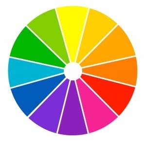
Primary Colors
Primary colors are the main colors of the color scheme and the color spectrum.
These colors can’t be created by mixing other colors together (that’s why they’re called primary colors) and are essential in the world of art and design.
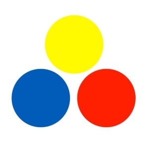
The primary colors are:
- Red
- Blue
- Yellow
Red is often associated with passion, energy, and excitement.
Blue is known for its calming and soothing effects, often associated with tranquility and trust.
Yellow is associated with happiness, positivity, and optimism.
Without them, there wouldn’t be secondary and tertiary colors, which we’ll talk about next!
Secondary Colors
By mixing primary colors, artists can create secondary colors such as purple, green, and orange.
For example, mixing yellow and blue creates green.
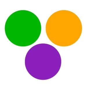
The secondary colors are:
- Orange
- Green
- Purple
Secondary colors are often used in art and design to create contrast, balance, and visual interest. Which are very important principles of art.
Let’s now go over the tertiary colors.
Tertiary Colors
Tertiary colors are created by mixing equal parts of a primary color with its neighboring secondary color.
These colors offer a vast array of tones and shades, so let’s go over them.
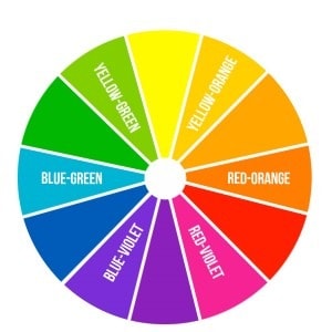
The six tertiary colors are:
- Vermilion: This is a warm and vibrant shade of red-orange. It is created by mixing equal parts of red and orange.
- Amber: This is a warm and rich shade of yellow-orange. It is created by mixing equal parts of orange and yellow.
- Chartreuse: This is a bright and lively shade of yellow-green. It is created by mixing equal parts of yellow and green.
- Teal: This is a cool and elegant shade of blue-green. It is created by mixing equal parts of green and blue.
- Violet: This is a deep and luxurious shade of blue-purple. It is created by mixing equal parts of blue and purple.
- Magenta: This is a vibrant and intense shade of red-purple. It is created by mixing equal parts of purple and red.
Tertiary colors are a crucial aspect of the definition of color in art, and they can also be found in natural pigments.
Color Temperature
When discussing color temperature, we’re talking about how a color appears to the viewer.
And it’s important to understand the distinction between warm and cool colors, as well as their emotional impact!
So let’s go over them.
Warm VS Cool Colors
Both warm and cool colors can be used quite effectively in your artwork, but you should know which color temperature to use.
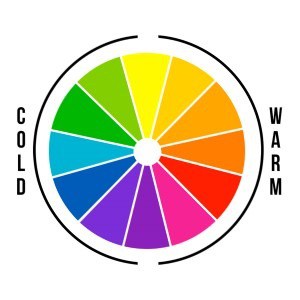
Warm colors such as red and yellow are associated with energy, passion, and warmth, while cool colors like blue and green evoke a sense of calmness and tranquility.
So if you’re trying to create a passionate scene filled with energy, go with a warm color. If, instead, you want to create a calm scene or even a sad scene, go with cool colors.
When warm colors are used in contrast with cool colors, like blue and green, they can create a contrasting visual impact!
So be sure to experiment with both levels of color temperature whenever you’re trying to decide between a warm or cool color.
Emotional Impact of Color
As an artist, you can use the emotional impact of color to intensify the atmosphere of the entire piece.
In general, colors have the power to influence our emotions in a very strong way.
As we mentioned before, warm colors like red and orange tend to evoke feelings of excitement and energy, while cool colors like blue and green can create a sense of relaxation or sadness.
Not only that, but by changing the color hue, value, and saturation, you’ll get a very different impact on your art.
Using a darker and less saturated color will create a somber mood, while a lighter and highly saturated color will have more energy!
So be sure to use these wisely in your artwork.
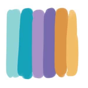
Color Harmonies
Color harmonies are combinations of colors that are visually pleasing and create a sense of balance and unity.
The 6 color harmonies are:
- Monochromatic
- Analogous
- Triadic
- Complementary
- Split Complementary
- Tetradic
The monochromatic color scheme involves using variations of a single color to create a harmonious and unified effect.
An analogous color scheme involves using colors that are adjacent to each other on the color wheel, creating a sense of harmony and cohesion.
A triadic color scheme involves using three colors that are equally spaced from each other on the color wheel, creating a vibrant and balanced composition.
Complementary and split complementary color schemes involve using colors that are opposite or near-opposite on the color wheel respectively, resulting in striking and dynamic color combinations.
Let’s see some examples of these!
Monochromatic
The Monochromatic color harmony uses a single color throughout the entire artwork.
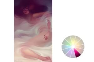
Contrasting levels of saturation and value in monochromatic art can create a powerful visual impact.
Studies[1] show that monochromatic paintings are more likely to evoke calmness and introspection in viewers. By using a single color and its shades, artists can explore the nuances and depths of that particular hue.
This technique allows for a focused exploration of the primary color, creating a sense of harmony and unity.
Analogous
In analogous harmonies, colors harmoniously blend and interact, creating a captivating visual narrative.
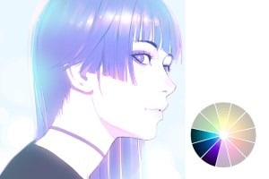
Analogous colors are those that are positioned next to each other on the color wheel. They reflect a sense of harmony and balance, as they share similar undertones.
By using analogous colors in your artwork, you can create a cohesive and unified composition.
Triadic
The Triadic color scheme, found by selecting three equidistant colors on the color wheel, creates a vibrant and energetic composition that can evoke a sense of playfulness and excitement.
The Triadic color scheme is a powerful tool in color in art, as it combines three basic colors in a harmonious way.
It can sometimes be tough to use correctly as an artist, but if you manage to master this color harmony, it can be very powerful!
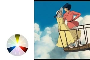
Complementary
Complementary harmonies (or color schemes) are created using colors that are opposite of each other on the color wheel, such as red-orange and blue-green.

They create a visually striking and harmonious composition that captivates the viewer.
These contrasting colors enhance each other and create a dynamic and energetic visual experience.
Split Complementary
Now that you understand the concept of complementary colors, let’s learn about split complementary colors.
This color scheme takes the idea of complementary colors and gives it a twist. Instead of using two colors directly across from each other on the color wheel, split complementary colors use one color and the two colors adjacent to its complementary.
This creates a harmonious and balanced color palette.
In a split complementary scheme, you start with one primary color and then choose the two colors on either side of its complementary color.
For example, if you start with blue as your primary color, the split complementary colors would be orange and yellow-orange.
Using a split complementary can be very interesting since it can give small accents or focal points within the artwork. Such as using a primary color for the accent while keeping the other two colors for the rest of the art piece.
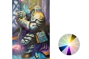
Tetradic
The tetradic color scheme involves using four evenly spaced colors on the color wheel.
These colors are created by using two sets of complementary colors, and they result in a very rich and explosive palette!
To create a tetradic color scheme, select two colors that are opposite each other (for a complimentary pair) and then choose another pair of colors.
Now you just need to use the four selected colors in your artwork.
The tetradic harmony can be very versatile and flexible with its rich color options, but it can be tough to work with!
Examples Of Color In Art
Let’s now appreciate the vibrant use of colors in art from famous artists.
Van Gogh’s “Starry Night”
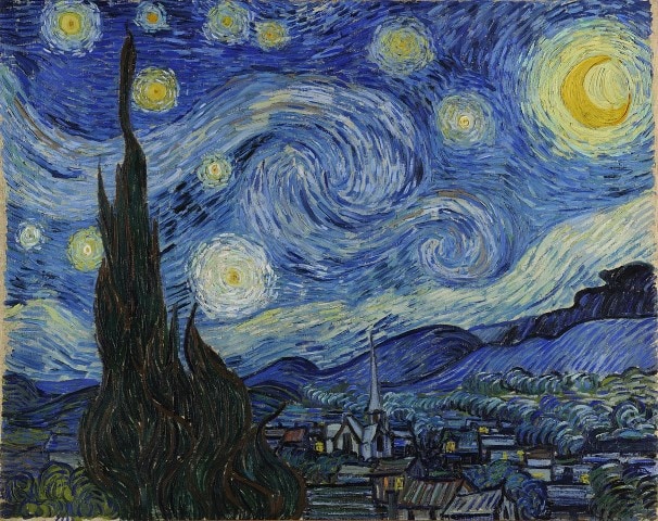
The purple hues in Van Gogh’s ‘Starry Night’ create a sense of passion and intensity.
Edward Hopper’s “Nighthawks”
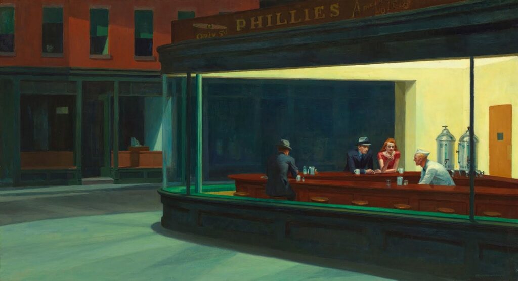
The use of stark contrasts and subdued colors, like deep blues and warm yellows, creates a sense of isolation and introspection.
Enhancing the atmosphere of urban alienation and melancholy through color.
Mondrian’s “Composition II in Blue, Red, and Yellow’
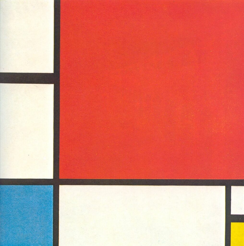
In Mondrian’s ‘Composition II in Blue, Red, and Yellow,’ the bold juxtaposition of blue and yellow creates a dynamic and energetic composition.
Kandinsky’s “Yellow-Red-Blue”
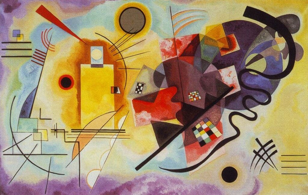
Lastly, Kandinsky’s ‘Yellow-Red-Blue’ explores the emotional power of red and yellow, creating a visual symphony of warmth and intensity.
Related Questions
Let’s go over a couple of related questions that you might have about using color in art, color schemes and color theory!
What is color theory?
Color theory is a practical guideline for color mixing and the visual effects of specific color combinations.
It explains how colors interact, communicate, and how they’re seen under different lights.
It’s a crucial part of creating a balanced and harmonious color scheme in art, and if you’ve read this far, you already have a nice assessment of color theory!
What is pigment, and how does it relate to color in art?
A pigment is a material that changes the color of reflected light due to wavelength-selective absorption.
In art, pigment refers to the powdered substance that is mixed with water, oil, or other liquids to produce paint, ink, or crayon. It creates the color seen when applied to a surface.
What does “listing the primary color first” mean in art?
“Listing the primary color first” is a way to refer to tertiary colors in art. Tertiary colors are made by mixing a primary color and a secondary color.
When naming a tertiary color, the primary color is always declared first.
For example, “red-orange” or “blue-green”.
This term helps artists understand the dominant hue in mixed colors.
I hope this article has helped you better understand color in art!
Be sure to check the 7 elements of art to make your artwork stand out.
And to learn more about upgrading your art, be sure to check our online drawing courses at a discount!
Patricia Caldeira is the main writer here at Don Corgi. She's an art teacher with over 20.000 happy students across many platforms and courses!
Enjoy your stay and as always:
Keep on drawing!
")
")

