Learning what a value drawing is and how to use one will be very important to grow as an artist and learning new and different techniques.
With it, we can better understand how to create depth and perspective in a drawing.
What is a Value Drawing? A Value Drawing is a black-and-white drawing. We use black, white, and all the gray tones in-between these to create light, shade, and contrast in a piece.
There’s more than one way to practice value.
It also doesn’t need to be hard.
If you keep reading, you’ll find some practical exercises, including how to draw a Value Tone Chart that you can do at home, and even some examples of Value Drawings to serve as inspiration!
Table Of Contents
What Is A Value Drawing For?
A value drawing is an exercise using only black and white and every shade of gray there is between these two.
The value in drawing or painting basically means how light or dark something is. We use value to add depth and perspective to a drawing.
For example, one of the most common exercises we can do to practice value is by shading a sphere!
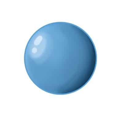
At first, it looks just like a circle, something very flat. But as we shade and add different shades the flat circle will start to look like we can reach and grab it!
This is very important to learn and practice because it will get you a better understanding of lighting and shading in a drawing.
The differences and contrast between light values and dark values are almost mandatory.
It is the difference between a homogenous painting and one that will grab the viewer’s attention. Of something that has different levels of depth! Using value will help the viewer understand what is away or closer to them in the scene.
Even with color, this concept plays an important part in your drawings.
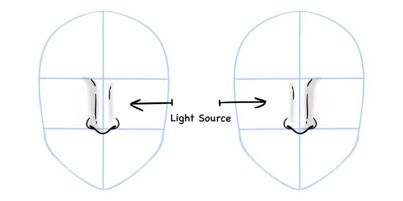
You’ll always have a light source that illuminates the subject of your work. Knowing where that source is and how the light will behave on the object is important so everything is balanced!
However, it is much easier to learn light and shading using black and white.
That’s when we turn to a Value Drawing. A lot of artists prefer to work in black and white and only when finished do they convert that to color.
This way, they’re sure they have the right values and the lighting makes sense.

You don’t necessarily need to work this way. As always, each artist has their own preferences and works differently from each other.
It is still important and I do recommend you to take some time and practice with value drawings.
A lot of artists prefer to work in black and white and only when finished do they convert that to color.
These don’t need to be finished products.
Sketches and simple scenes with very simple objects are more than enough. What matters here is that you have a good light source that will capture different values.
- Try different places with more or less light.
- Change the direction of your light source!
You’ll have different results depending on how close or far the light is.
The properties of the subject or object you’re using will also change how the light will behave. But simply put, where the light touches the most, the brighter the object will look.
And the farther the light is, the darker the drawing will be!
A Value Drawing is especially important if one wants to draw in a very realistic style.
Nevertheless, I feel it’s still important to learn, even if you’re going to draw only cartoons or other styles.
Having a good sense of light and dark in painting or drawing is very helpful in creating a balanced and interesting piece of art.
Value Drawing Examples
You can do a drawing value both in traditional and digital!
If you’re doing traditional, I’d recommend using graphite pencils. I’d say something from HB up. You don’t need a lot of them, a 2B, 4B and 6B pencils are enough for this kind of exercise.
Different levels of graphite change how hard they are.
The B scale is the softer kind of graphite. This means they’re the best to shade and produce different values. Now you just need some paper to draw on.
I always recommend the Canson XL series! I’m a big fan of this brand, their paper is always very good and comfortable to work, with any kind of tool.
As for digital, simply open the drawing software of your choice and a brush that you like.
To make things easier for you, you can even set the document to grayscale, this way no color will be used, even if you pick it by accident.
I recommend choosing a textured brush and something that has different values depending on the pressure you apply. This way, it simulates graphite very well and you can control how dark or light the drawing will be.
Now as for the scene it can be as simple or as complex as you wish! If you’re a beginner I’d say to start with simple objects like a sphere, fruit or vases that you might have at home. But a Value drawing can go further than this! It can be a portrait or even a whole room or environment.
Some good examples to look at are ‘The Four Horsemen of the Apocalypse’ (image below) and ‘Praying Hands’ by Albrecht Dürer.
A German painter from the Renaissance period.
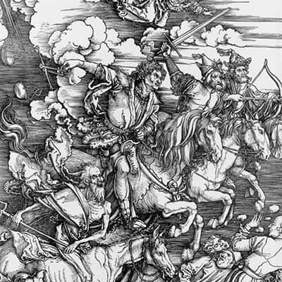
He worked not only with color and oil, but there’s also a lot of engraving and works done with a value scale made by him that I recommend seeing, especially if you’re interested in value drawing and looking for inspiration.
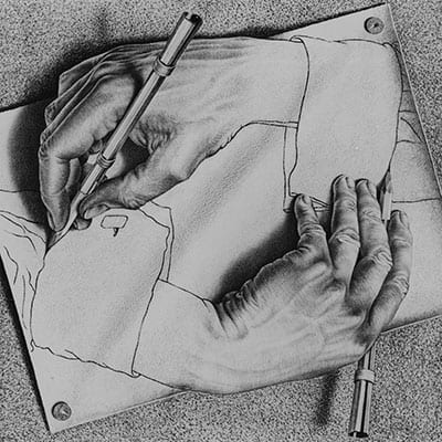
Another favorite of mine is E.C. Esher.
His works are very famous because it uses a lot of optical illusions, creating very interesting and beautiful compositions! Most of his work is black and white, so it’s also great to study value and how you can work with it.
On a more actual and modern approach, Loish works a lot with almost monochromatic color schemes and also posts some grayscale studies and works on her Instagram, like this one and another example here.
I really recommend following her work, since it’s always so beautiful and calming. She also does some tutorials from time to time and they’re always worth to check out!
I also love Ilya Kuvshinov’s work!
So naturally, I recommend following his work on Instagram as well, where he posts new work almost daily. There’s a lot of value drawings that are definitely worth a look.
Value Drawing Techniques
There are different drawing techniques that you can try and explore.
As I said, you can pick up some graphite pencils and use them to draw and shade normally. Apply more or less pressure depending on how dark or light you want the subject to look.
But you don’t need to limit yourself. There are no rules in drawing as long as you get the desired effect and that you learn something from it!
For example, you can use a hatching technique!
You can do this with either graphite pencils, but also with inking pens (here are our favourites). With this technique, we create shading effects by creating parallel or crossed lines.
The closer the lines are to each other, the darker the shadows will be.
Albrecht Dürer’s work mentioned above is a very good example! The shadows on his engravings are mostly done with parallel lines.
Another fun technique that you can use is pointillism.
The concept is very similar to hatching. The closer the dots are to each other, the darker the shadow.
If you want to capture lighter zones, then you’ll draw fewer dots until there are no dots at all.
Both of these exercises are very helpful. Not only will they teach you and help you have a better understanding of how to shade, but it also helps you feel more at ease with drawing.
It’s the kind of exercise that will help you relax and worry less about how your lines look.
This way, your drawings will start to look smoother and more natural!
Finally, you can try different tools.
For example, it’s very different to use graphite pencils than inking pens.
When using graphite, you have more control over the drawing. If you apply more pressure to the pencil, the darker the lines or shades will be. The less pressure you apply, it will become lighter.
With inking pens, however, the amount of ink is almost the same depending on the pressure you add.
If you want a thicker line, you need to use a pen with a thicker nib. There are also different types of nibs to try and explore, and they will have different effects!
What about paint, watercolor, or even India Ink (my recommended
I really recommend doing some exercises with the latter, since it’s a very fluid ink and easier to work with values. It’s a common practice to do in art school and classes.
It’s usually black and it really helps us understand the value and how to control it. It is very fun and interesting to try, even if you don’t usually paint!
Here’s a great example of how you can use India Ink and create beautiful values with it:

Value Drawing Ideas And Exercises To Practice
As I mentioned before there are a lot of themes you can go for when practicing value drawings. Of course, some are easier than others and it also depends on what you want to focus on your art.
Here are a few examples:
- Draw a sphere. This is the most basic exercise you can do and I 100% recommend this one for beginners. Just start by drawing a circle and then shade it! Choose where your light source is and then apply the shadows according to it. The farther it is from the light source, the darker the shades will be.
- Draw fruit. Once you get a hang of spheres, up your game with some fruit. Start with oranges and apples, since they have a similar shape. Then as you get more confident try to draw different fruit with different shapes.
- A glass jar or vase. Drawing glass is very different than drawing other types of materials. The way the light hits and shines is always very interesting and fun to draw. The same goes for metallic objects, so do practice with those as well!
- Draw a portrait. If you’re more interested in drawing people, it’s good to do anatomy value drawings. Either some portraits or the whole body is a great exercise!
- Draw your room. Or parts of it. Try to draw it at different times of the day, so that the lighting is different. You’ll see how much the room will change in your drawings.
I highly recommend you do each exercise by taking pictures of the objects or subjects you’re drawing and then turning them into grayscale mode.
This way, you can really see what you’re drawing in black and white, and it’s easier to understand and learn.
Here are a few more easy drawing ideas to try out (click to check out the article).
Alternatively, you can always find reference images on Pinterest or stock photo websites like Unsplash.
This way can be a bit more difficult sometimes since you don’t have as much control of the object you want to draw.
By taking a picture yourself, you’re sure you have the shot and view you want and many household items you can use for your practices!
Seeing Values On Your Drawing Software
Either if you take your own pictures or find reference photos online, you might need to convert them to grayscale.
If you’re taking your own photos, I recommend taking them normally and then converting the image into grayscale in a drawing software of choice.
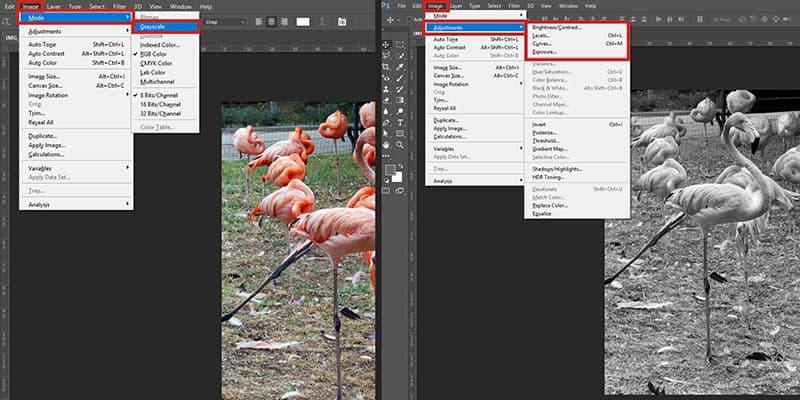
Now to convert your photos it is very simple! If you’re using Photoshop, simply open your image in it. You might have to unlock the layer. If the layer appears with a tiny lock, double click the layer and click ok.
Next, just go to ‘Image -> Mode -> Grayscale’. It is done!
It is worth noting that you can still add some more edits to your images or the ones you find as a reference. For example, you might want to add some contrast or for some shadows to be stronger than others.
There are a couple of ways to do so.
Go to ‘Image -> Adjustments’. You can now choose the option that you prefer or feel that makes more sense. If you want to change the overall brightness and contrast of the picture, choose ‘Brightness/Contrast…’
If you want more control over the shadows and lights, choose ‘Levels…’ or ‘Curves…’.
Personally, I like to use the ‘Levels’ menu. It is very simple and straightforward to use, especially if you want to make minor changes.
A lot of image software has the grayscale mode option, so you’ll find it very easily. Photoshop just has some more options for you to use.
Even our phones can do this kind of editing! Just remove the saturation of the photo you just took and then play with the brightness and contrast of it until you get the result you want!
There’s also an app that you can use both on mobile or on the web that’s really simple and useful to use.
It’s called Pixlr and you don’t even need to download it, although you can if you wish to.
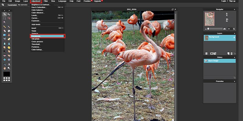
To turn your picture into grayscale, simply open it, then go to ‘Adjustment-> Desaturate’.
Now, just like in Photoshop, you can edit your photo as you want. Go to the ‘Adjustment menu again and choose the option that fits you best!
Tonal Value Chart
Before starting drawing spheres or other objects, to become more familiar with value, it is recommended to draw a value chart or scale first!
This is very simple to do and it will help you understand and draw/paint value. It will also help you have more control of the tool you’re using.
To draw a value scale, pick a piece of paper.
Now you can draw some squares. It can be as many as you want, but I recommend not going over 9 and a minimum of 5 or 6 squares. You can number the squares if you wish to.
Your first square will be white, this means you don’t need to do anything in that one.
The last square will be black! Pick up your pencil, the softest you have. A 4B or 6B does the job well. Fill up the square as dark as you can.
Now you need to fill all the squares in-between. The closer it gets to the black square, the more pressure you want to add when filling the square.
You should fill the squares starting from the first.
As you go, add more pressure to your pencil! Try different scales with different pencils. You can start with an HB pencil, then try a 2B and so on.
The important part is to have the values ranging in contrast, from white all the way to black. With a value scale ramping up through the grays.

I recommend trying graphite pencils on the B side of the scale since this kind of graphite is softer and ideal for this kind of exercise.
But you’ll notice that depending on the type of pencil, you get different results.
I really like this Faber-Castell pencil box. It has a wide range of graphite pencils but turned more to the softer side, which is perfect for this exercise!
Just go from light values, all the way to the darkest value in the value scale.
If you keep a nice flow of different tones, you’ll even create the illusion of gradient shading!
Related Questions
What is a value scale for in color? It is the same kind of scale but instead of going from white to black, passing through many different shades of gray, you choose a color. For example, if you want to draw a value scale of the color blue, you start with white, then paint different shades of blue until it turns black! The process is the same as the one mentioned above, but with color added!
What is the difference between value and tone? Simply put, they mean the same. It means how light and dark something is. Generally speaking, we call tones, the variations of colors and shades that appear between white and black.
Now that you know about Value in Drawing, here’s how you can draw in Negative Space using these techniques!
Stock images by Depositphotos
Patricia Caldeira is the main writer here at Don Corgi. She's an art teacher with over 20.000 happy students across many platforms and courses!
Enjoy your stay and as always:
Keep on drawing!

")
")
