Having trouble shading drawings? I’ve been there!
Through my years of experience in drawing and working as an Illustrator, I’ve compiled this extensive complete guide to shading your drawings by drawing shadows and light.
Why is shading so hard? From all the people that wrote to me, telling what they find harder to do, shading is probably the one that pops up more often. Drawing hands and feet as well.
Keeping it simple is the trick here and I’m gonna help you with that. Some theory here and exercises there and, hopefully, at the end of this article, you’ll be the Shading Champion!

Shading is a very important aspect of art. It gives depth, it brings emotion and can change the entire composition of your piece.
So I’m here to teach you all you need to know with this light and shadow drawing tutorial.
Without further ado, let’s go through everything you need to know about Shading Drawings and other pieces of art!
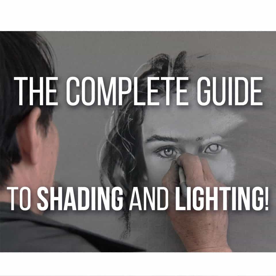
Table Of Contents
What is Shading in Art?
Before we start, let’s talk about what exactly is shading, and what is the purpose of drawing shadows in our art.
Shading is a technique that will give a 3D feel to your art. You add darker tones in certain parts of your drawing, to give some more depth and emotion to it.
By drawing shadows in different values and with different styles (will go more into this matter further below) on an object or character, you can make your art really pop out, making it feel more realistic and alive.
This is exceptionally helpful when figure drawing, creating environments that don’t look paper-like and general character and creature design.
It’s a great way to better define muscles in characters, play with proportions and even create a Mood (happy, gloomy or otherwise) in your overall art piece.
I would also just like to say that shading does NOT have to be drawn or painted in black or very dark grays.
A lot of artists when shading, tend to just use black lines with different line weight and pressure level, and even though that is a good way to do this, I would recommend you to try different colors.
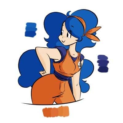
In fact, I would say that if you’re not working with Grayscale or Black and White, never use these tones for shading. Always try to use darker tones of the base colors you’re using!
Colors can really change what the viewer thinks of your piece and how they perceive it, so do consider trying out different colors in shading and see what works best.
I’ve written a whole article on Color Theory for Artists, so if that interests you, do check it out!
So yes, shading brings a whole new perspective to our drawings, but to use it correctly, you have to know quite a few things. We’ll talk about them in-depth below.
Understanding Light and Shadows
So first we need to talk about what is Light and Shadow.
When drawing objects and environments, we are already drawing how they behave in certain light or shade.
Objects aren’t just in the light or in the shadow. Since the light bounces around (we’ll talk more about this further down) we’re already drawing how the object behaves with that amount of light.
I don’t want to go into too much theory here, so just bear with me for a second: Very simply put, a shadow is when there isn’t any Direct Light hitting the object.
But there’s more to it than that, so let’s first talk about Value and what it represents in shading.
Value In Shadows And Light
Value helps to set the illusion of depth.
By using different values across an image, you can give it a better 3D effect than when for example using just a single value across the board.
This is a scale of how dark or how bright a color can be and by using it when shading you can really make your art pop.
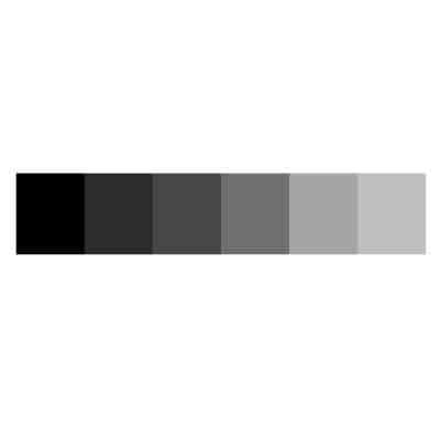
In shading, we use value by assigning different values of darkness and light to different parts of the image we’re drawing.
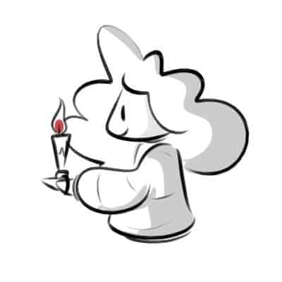
For example, an empty room with a single candle lit will have a much different gradient of values across the room than an empty room with 10 light bulbs on.
There will be many different shades across the room with the single candle.
And the farther away the light reaches, the darker the shade will be (until it turns into a deep and complete shadow since the light doesn’t reach there).
On the other hand, the lighter it will be the closer it is to the Light Source (the candle), until you can see the object clearly and with its own colors.
Don’t stress too much about the theory of Value, what it simply means is: The more light an object gets, the lighter it will appear, and the less light it gets, the darker it will appear.
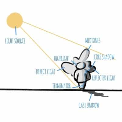
So we need to pay close attention to where and how strong the Light Source is, and where is the Terminator.
Light Source and Terminator
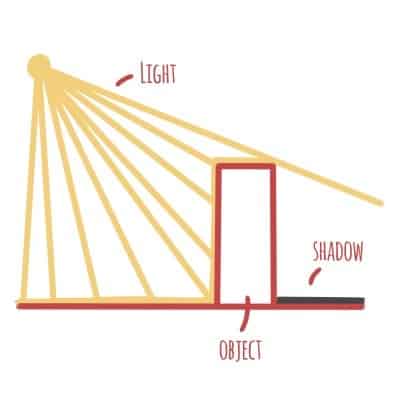
Basically put, a Light Source is where the light is coming from.
When talking about a light source though, we need to pay close attention to two fundamental things: Distance and Intensity.
Distance is exactly that: the distance the light source is from our object or environment.
And Intensity is also pretty clear: how intense or how strong a light source is.
Our Light Source changes the way our objects look when being drawn. For example, the farther away a light source is, the darker the object will be. On the other hand, if a light source, with the same intensity, is closer to the object, the latter will be lighter.
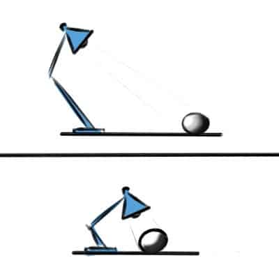
A stronger and more direct light source will also create a more focused shadow right behind the object, where a more diffuse light source will gray out everything around the object instead.
So how exactly can you know when the shadows start being created behind an object? Where is that exact point?
That’s where the Terminator comes in.
No, not the movie, we don’t use robots from the future trying to kill people here!
The Terminator is essentially the answer to our question, it’s a line between the light and the shadow.
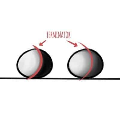
Now, as we talked before the intensity has a big play on how the shadows behave. So the stronger our light is, the sharper our terminator is.
And if the light is weaker and less intense, the terminator will be blurrier and more diffused!
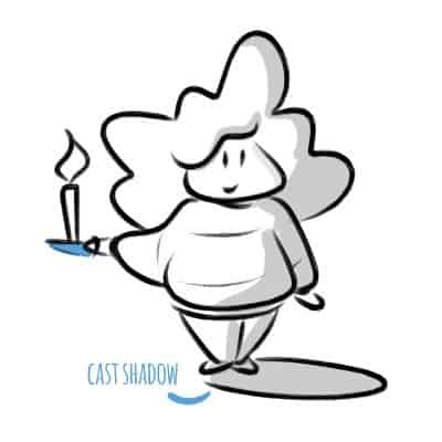
After the terminator, on the dark side (they have cookies!), there are a few things that we have to talk about: the Cast Shadow, where we can find the Umbra and Penumbra.
Cast Shadow – Umbra and Penumbra
Cast Shadow is the part “behind” the object where the shadow is. Like the name says, it’s the shadow that is cast by the object. A very important thing to know when you’re drawing shadows.
But if you look closely at it, the shadow isn’t all the same right?
It’s not just a black spot in the middle of the ground, like a black hole that will swallow everything.
It’s a shadow created by different shades around it. And those different shades are the Umbra and Penumbra.
The Umbra is the darkest part of the shadow cast by the object; it’s the innermost shadow opposing the major light source.
This is where most of the artists can mess up when drawing shadows, they only draw a direct umbra behind it and call it a day. But it can be much more detailed than that!
If that’s your style, try practicing both these features, and you’ll see the difference!
Right next to the Umbra, there is the Penumbra.
The Penumbra is the area near the Umbra where only a part of the light source is obscured by the object or figure.
It’s usually more easily seen when you have more than one light source in an area at the same time. What this means for you, when drawing, is that the Penumbra is where you’ll draw a lighter shadow than the Umbra area.
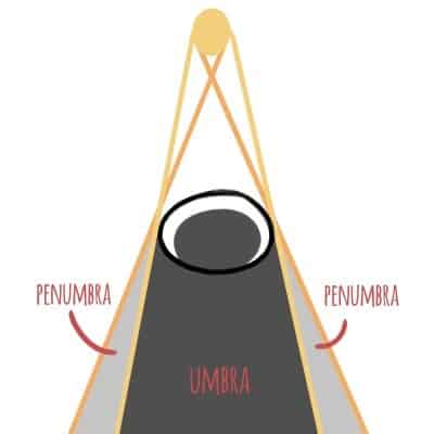
So you’ll never want to draw a darker shade near the umbra, the umbra will be the darkest shadow you will ever draw for that specific object.
Now, I’ve been going on and on about drawing shadows and the dark side of the force (I promise, I’ll shut up about Star Wars… maybe!). Let’s take a break from it now and talk about Light!
Direct Light, Highlight, and Mid-Tones
When choosing your light source, there will be many different types of light appearing on the object as well. Let’s go through each part, one step at a time.
The Direct Light (also called the Full Light or Core Light) is where the light hits the object directly.
Even though the Direct Light is the area where the light source hits the object directly, it is still darkest than one other part of the object, which is the Highlight.
The Highlight is the lightest part of the object, it appears differently depending (again) on the light source, its distance, direction, and intensity.
To make it easier to understand this, all you need to know is that the Highlights are those spots, almost white, that you add when painting some jewelry, for example. That shiny bit of light. It’s what makes the light and drawing pop up!
Then we have the Mid-Tones, which also have an important part here.
The Mid-Tones are the darkest part in the light side. They are closer to the base color but still lighter than any shadow you’ll paint.
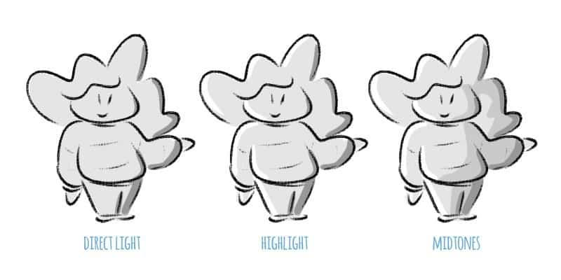
What this means in your art is that you will need to create different values on your light side as well.
Value is always the main component when highlighting or shading your drawing, so use it a lot!
Core Shadow and Reflected Light
Right after the Terminator (the line between the light and dark side of the object or figure), there is the Core Shadow.
The Core Shadow is the area after the terminator, where the shadow sits directly behind the object.
Don’t mix Core Shadow with Cast Shadow!
Unlike the Cast Shadow, the Core Shadow is on the object. The cast shadow is on the surface behind or below the object the light is shining on, so try not to mix up those definitions!
The Core Shadow is darker than the mid-tones on the object but usually lighter than the cast shadow. It’s mostly the same shade value as the penumbra.
The value of the core shadow can be modified by one thing, which is the Reflected Light.
The Reflected Light is the part of the object on the shadow side, where the values are modified by the reflection of the light source on different surfaces.
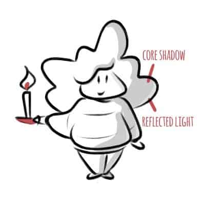
This basically means that the when the light bounces around the room or space around the object, it reflects back toward the object, creating a lighter tone.
In short, even when we are working on drawing the shadows side of the object, there’s still some light going on there.
This is the reason there rarely is any pure black shadow. Even simple tiny particles in the air can reflect light back to the object.
Now all this theory must be tiring you, so let’s put all of this new information to practice, so we can understand it better!
The 4 Shading Techniques To Master
To get the shading right, and give your artwork a sense of three-dimensionality, you’ll want to master some shading techniques.
Here’s a disclaimer though, you don’t need to master every single one! But I recommend that you at least give each one of them a try. Just keep your motivation up and keep going.
There are a lot of shading techniques that you can use, even more than the ones I’ll talk about here! So here are the 4 main shading techniques that you should try and have fun with:
Hatching
Let’s start with one of the most simple shading techniques to learn:
Hatching! A shading technique where you draw parallel lines to give a sense of three-dimensionality and depth.
Now, depending on a few factors, you can change how each part of the object you’re shading looks like. These factors are Distance, Thickness, and Pressure. Each one of these will have a different effect depending on how you use them.
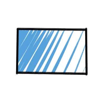
Experiment with this! For example, try to increase the Distance between the lines.
What happens?
The intensity of the shadow will be weaker than if they were close together. In short, drawing the lines closer to each other will give you a darker shadow, but if you put some distance between them, the lighter your shadow will be.
Let’s try something different! Thickness can have different effects in your drawings of shadows.
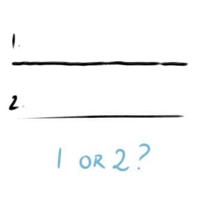
Thicker lines can represent a bigger area of the same type of shadow being used, this means that the shadow area will have a higher contrast if you only use thick lines.
When you use thinner lines, however, it will make the area that you’re shading less contrasting and will be easier to blend with other nearby shadows.
Finally for the Pressure, the stronger the line is, the darker the overall area will look like. The opposite is also true, where a softer pressure level will make the shadow area lighter.
Now you shouldn’t just choose one type (for example, large distance, thick lines and high pressure) and go with it for the whole shading.
It’s best to try to mix different levels of Distance, Pressure, and Thickness according to the area you’re shading so that everything blends well together.
The best way to do this is just by practicing a lot and trying different ways to shade, this is true for every shading technique so don’t be shy and experiment a lot!
Cross Hatching
A simple variation of Hatching which is widely used: the Cross Hatching.
Cross Hatching is a shading technique where you create two sets or more of lines that intersect each other to create drawings of shadows.
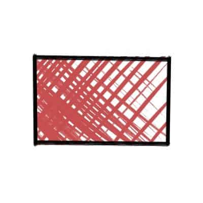
This is one of the most used techniques in shading. Mostly because it works perfectly and, well, it’s fun!
Most of the times this is done by drawing parallel lines in the area that you want to shade and then drawing perpendicular lines to the previous ones. That is what cross-hatching is all about.
Now to give them depth and three-dimensionality!
Draw the lines closer together for darker areas and further apart the closer they are to the light, making a gradient of sorts through the use of only lines. Isn’t that amazing?
If you’ve got this far I recommend you go ahead and shade an object with these two techniques, Hatching, and Cross Hatching, and see which one you like best.
These can be very similar but they please different crowds! I’d say Cross Hatching is easier to work with, so it’s perfect for beginners.
But give both a try and you’ll know what you prefer.
Smooth Shading
This one is a bit different. It’s called Smooth Shading.
Smooth Shading is a shading technique where you create a shadow area by blending the values according to the darkest and lightest spots on your object.
What this means is that instead of creating lines side by side you’ll create an entire shape that will slowly darken to the darkest point in the object.
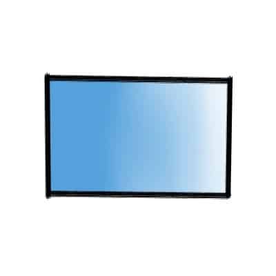
The important part of this technique is to control the Pressure you do on your tool.
This can be done in several ways.
The most basic one is by holding your tool (pencil, drawing tablet or whichever you prefer) and start by putting very little pressure on it while drawing from side to side.
Then you just need to increase the pressure steadily the closer you are to the darkest value you want to have in your shadow.
A very popular way to do this, especially when we’re kids, is drawing a dark spot and then using your finger to blend everything together.
This can be a bit messy and hard to achieve, but it’s a fun way to do it and can lead to interesting results!
Stippling
This is the last shading technique that will be talking about in this article, Stippling.
Stippling, also known as Pointillism, is a shading technique where you draw small dots in the area you want to create the illusion of depth.
This is also an art format, where you can do an entire piece of art by stippling!
It can lead to very interesting results, and normally if you stand far away from a piece that is shaded with stippling, you won’t even notice the little dots. It really creates a very cool optical illusion.
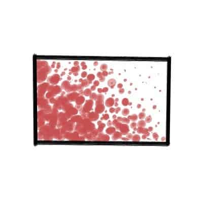
The most important factor in Stippling is Distance.
Since most of the times Stippling is done with ink, there is no pressure or thickness factor on your shading. The only factor that really matters here is the distance between each dot that you create.
The closer the dots are, the darker the area will look. And the opposite is also true, where the farther away the dots are, the lighter the area will look.
I know this technique can sound weird but do give it a try, it’s a super fun technique to work with and it makes beautiful drawings.
Remember that you can also mix and match each of these techniques in one single painting or drawing and get really interesting results. As always, experiment!
Shading Exercises
Here are a few shading exercises that you can start doing today to improve your shadings in your drawings, and increase your understanding of Shadows and Light.
I’ll talk in-depth on how to do each one further down below, but here they are:
- Shade A Ball
- Hatch (or Cross Hatch) a Page
- Shade a Coloring Book
Let’s now go through them one by one.
Shade A Ball
This is a super simple shading exercise that anyone can do.
Are you just starting to practice shading? Shade a Ball. Are you a Professional artist that wants to get better at shading or practice a new technique? Shade a Ball!
It’s really one of those exercises that you can do over and over again and just get better at what you do. It’s a perfect exercise since you are also improving how you draw shapes and how you can create depth.
So here are the simple steps:
- Draw a Circle
- Create a Light Source
- Shade it into a Ball!
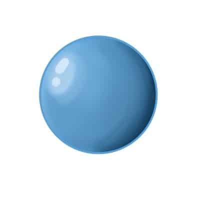
Oh and for a step 4: Repeat. Practice again and again, all over the page.
Remember to try different directions of light sources to really get the most out of it.
Hatch (or Cross Hatch) a Page
This one is also a very helpful exercise that you can even do without thinking too much while waiting for a bus, bored at work or waiting for the washing machine to finish laundry.
Practice Hatching or Cross Hatching a blank Page.
Here are the steps:
- Draw a Square
- Hatch or Cross Hatch it
That’s it!
Repeat it with different sizes and shapes throughout the sheet of paper, or simply imagine your entire paper is that square or rectangle.
Try different Distance, Thickness, and Pressure. Experimenting and trying out different ways to do things is very important. Not only you’re improving your skill, but you’re also learning about yourself and your own art style.
This will also help improve your Line Quality, so if you’re having some difficulty with that, practice this a lot!
Shade a Coloring Book
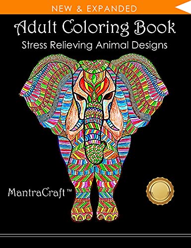
Get one of those Coloring Books (I like this one) and shade everything!
Even though these books are mostly for relieving stress and for, well… coloring, they are amazing to practice your shading techniques. You’ll be relaxing AND learning more about coloring and shading. It’s perfect!
If you’re tired of drawing circles and squares to practice, or just don’t want to practice your techniques in your final drawings, I really recommend you to try this.
Simply:
- Buy a Coloring Book
- Color it
- Create a Light Source
- Shade it!
Keep it simple and have fun, this will not only help you improve your shading techniques but also improve your coloring and creating new characters, objects, and environments!
Shading With Color
Since we’ve talked about Coloring books, here are some quick tips in case you’re shading using Color and not just Black and White!
The same principles of shading apply, just remember three very important aspects of shading with Color: Value, Hue, and Saturation.
So my very simple quick tips are:
- Play with Values
- Be careful with your Saturation
- Try Different Hues!
There is much to talk about here, so I’ll just leave a link to my article here on Color Theory for Artists, in case you want to read more about it!
Also, remember, when using colors, never shade a drawing with black and grey tones.
Use value to pick darker tones of the base colors you’ve used, and you’ll see that your drawing will look much better.
Related Shading Terms
Here are some other shading terms that you might have heard about but aren’t quite sure what they mean!
Chiaroscuro is using very high contrast in artwork by using very dark shadows and very strong lights. This a great way to create dramatic scenes and cinematic ambiance.
Color Theory. If you’re really interested in shading correctly your drawings and paintings, you should learn about Color Theory!
Summing It Up
Now you’ve learned about how you can use shading to improve your artwork depth and a lot of shading techniques like Hatching, Smooth Shading, and Stippling!
It’s time to practice. So get drawing with those shading techniques you’ve read about and I promise you, you’ll get better in no time.
Want to put those shading skills to use? Here are 5 Anatomy Drawing Exercises To Improve Quickly!
Thanks for reading and I hope you learned a lot today!
Patricia Caldeira is the main writer here at Don Corgi. She's an art teacher with over 20.000 happy students across many platforms and courses!
Enjoy your stay and as always:
Keep on drawing!

")
")
